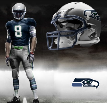
Yesterday we started a discussion about possible uniform changes for the Seahawks in 2012 when Nike take over the supply contract for the NFL. I linked to a website created by Tim E. O’Brien, who has taken the template for Nike’s ‘Pro Combat’ uniforms used by college teams like Florida, Alabama and West Virginia and created similar designs for all 32 NFL teams. Noticing a trending desire from Seahawks fans debating the issue on this blog, Tim very kindly put together three further designs which you can see below:
Thanks to Tim for the new designs. Don’t forget you can see his other Seahawks creations on his website or by reading yesterday’s article here.


I love these. That bottom one is ridiculously cool.
I’d love to see these worn by the team.
Any would be better im in!!
I’m not a huge fan of the Pro Combat to be honest (a bit RoboCop for my tastes), but given that that was his template, these are some nice unis. Rather than having the Seahawks logo on the undershirt I’d prefer it on the jersey sleeves – mostly because it would look better for fans who want to represent wearing a team jersey. The helmets are ace, the socks…not so sure. Overall, a good job though and I thoroughly appreciated the effort put in.
colorways are similar to the Patera days but I get a sense of the powder blue jersey being little soft..wished we still kept the current helmets as main and these silver things as alternates.
I like the last two pics best, but don’t like the horizontal stripes on the sleeves and socks. I’d prefer an updated version of the 1980’s style logo on the shoulder part of the sleeves (but would tone down the blue and green used back then.)
I can’t see if it’s included in this design, but I’d also like to keep the green piping around the neck of the current jersey. That is so cool.
But lose the green belt!
I’m with you 100%
I the silver helmets are epic. If they look as good in real life as they do on the picture I say use them next season and say to hell with Reebok.
The*…
BTW, the player in the pics doesn’t look anything like Matt Hasselbeck. What’s he doing wearing number 8?
The top one reminds me of the dark blue the Hawks used to wear. The bottom one reminds me of the current “gun” metal blue.
I’m guessing he went with the green belt to get that color in there a little more. The Hawks used to wear a blue one. Either one, due to contrast, would be better than silver.
I haven’t been a fan of multiple stripes for socks since Chuck Knox introduced the single, thick, strip in ’83.
Those helmets look like the new anti-concussion ones. If so, not only are they cool looking, but they’re tough as all get out.
http://mickelyantz.com/HawksWebPics/2001prototype.jpg
Here’s a link to the original press conference for the release of the new uni’s back in 2001.
From what I remember, the Seahawks tried to roll out two helmets. The Blue helmet for the Home games and the Silver helmets for the away games.
I think the Silver helmets looks amazing.
http://espn.go.com/page2/s/newlook/seahawks/uniforms.html
here’s another link…
DUDE! I like it..I like it A LOT. A good mix of the expected colors with a new twist. Those picks make me feel like I am about to play NFL Blitz or something.
I would love to see a combo of the new meaner logo with the old colors. Our light blue with green and silver was the best colors in sports. Im all for it.
Tim’s drafts would look sweet with the 1976 uniform sock, pant and shirt stripes along with a grey face mask.