Today I’d like to introduce the new Seahawks Draft Blog logo. I’m sure you’ll all agree that my web designer David Leng at Starry Sky has done a fantastic job not only with the logo, but also with the new interchangeable banner. If you haven’t noticed already, keep your eyes fixed on the top of the page and wait ten seconds. You’ll notice the quirky new idea and this is something we can maybe play around with in the future, potentially having a top-10 mock draft included in the banner down the line.
While we’re on the subject of design, you may also have noticed comments by Seahawks President Peter McLoughlin discussing the possibility of throwback uniforms in 2012 to coincide with the introduction of Nike as the new supplier, replacing Reebok. McLoughlin also touted the possibility of changes to the team’s permanent uniforms which have been in use since 2002.
A bit like the draft, it’s a subject that some people love to discuss while others try their hardest to avoid. I’ll confess that I enjoy talk about uniform changes, but only because I’m only ‘satisfied’ with the current design. I’m sure others will disagree, but I think they look a bit dated and the constant mixing around of combinations (not to mention the hideous lime green number) is something that ultimately you’d prefer to avoid. I like the idea of a timeless look, one that can span generations. Green Bay, Dallas and Pittsburgh have managed to find rather simple designs that never age. I’d like to think Seattle can find something similar.
The Vancouver Canucks ice-hockey team had a similar identity crisis, switching between many different designs before settling on a classic look during a league-wide overhaul of uniforms. For me, they have one of the best designs in the NHL. Perhaps it’s coincidence that their color scheme is one very similar to the Seahawks, but I don’t see any reason why Seattle can’t follow Vancouver’s lead.
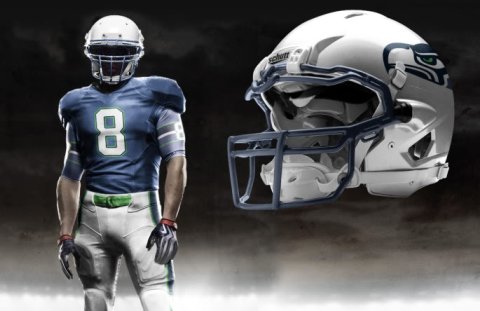
The design below has appeared on a number of web sites over the last couple of years and I don’t know the artist to give the appropriate credit, but for me this would be a great way to try and find that iconic look.
McLoughlin mentioned in his interview that Pete Carroll had taken part in meetings the team had conducted with Nike about possible changes. Carroll had a significant role in a lot of the decisions USC made, possibly also in the team’s image. USC switched from this classic jersey used for many years and went for this look during the 80’s and 90’s. During Carroll’s era at Southern Cal, they went back to a more traditional design and also avoided the kind of gimmicks used by Nike for a lot of the other big schools. Could he add his voice to any claims for a similar change in Seattle?
Of course one of the more recent gimmicks by Nike is the introduction of ‘Pro Combat’ uni’s for some select schools such as Florida, Alabama and West Virginia. Tim O’Brien took the template for those uniforms and translated it over to the NFL teams. You can see his home and road ideas for Seattle below, as well as a further design from an anonymous artist.
Whether you are for or against changes to the uniform it’s a topic that always generates a discussion. In the current climate of litigation, it’s one of the few topics left open. So what do you think?


I think I like them. It takes several minutes of looking, but the longer I do the more I seem to like them. I think the bottom picture is my favorite. The white uniforms are a bit blah, but the bottom one strikes me.
I’m thinking the away uniforms are a little bland, but I do really like the idea of keeping the change up simple from week to week rather than the 6 or 8 combos we had last year.
I like the current set of uni’s. I think the best thing for the team is to try to do something unique. I find the teams that you mentioned uniforms to be really boring and some of the worst designs in the league. I know that I am in the minority but I liked the fact that we were one of the first teams to really try to modernize the league. All I ask is that they don’t get rid of Seahawk blue not the navy and keep the neon green, otherwise keep it pushing design forward.
I really like the Grafix (top, computer design) versions. For me the kind of classic simplicity and the logos on the arms, combined with the grey pants and helmets looks pretty awesome.The jersey in the bottom picture is too busy for me and as such I think it would date quite quickly. I’d like to keep the lime green, but only small hints of it in the logo and stripes, not on the belts or undershirts. Our current away uni is awful, all of these alternatives are better in my opinion.
I agree with having only one home, and one away uniform.
They are extremely cool every single one of them. I especially like the blue color on the last one. And the ideas about putting the logo on the sleeves are just awesome.
I wouldn’t be against it even though i like our home jersey as it is, but the truth is that the current uniforms are kind of boring, especially our away jersey. And the alternate green we have at the moment shouldn’t even be seen by people who are able to see colors and design, they’re just awful.
I don’t know if this is a point in their favor or not, but silver helmets would go better with lime green jerseys. Just saying, for those of you who *liked* the green alternates. (I didn’t.)
The blue helmet, green jersey look suffered from the same “too busy” feeling as the jersey in the bottom picture. I agree with Al U, those would quickly become dated.
My vote would be for the classic look shown in the first picture, which hearkens back to the first years of the franchise. But maybe a darker version of the blue jersey — we should keep the current dark blue as a reference to our Super Bowl year, but combine it with silver helmets and logos on the sleeves, for continuity with the pre-Holmgren era. (None of wants to remember the Behring era, but the Nordstrom years were something special.)
A more up to date version of the classic look gets my vote.
I do like the uniform mixes going back with the Silver-Gray Hawks colors but also really like the Dark Blue Uni’s.
I think the Full Dark Blue Uni’s for Home and the Full Silver Gray Uni’s for away would be great.
An alternate might be interesting to have a mix of the two or or possibly a mix similar to the the last anonymous artist’s uniform. Not a fan of the full neon green though.
It will be interesting to see what happens.
All the best,
Scott
I liked a lot of the design concepts Nike came out with but I wonder what they would look like on the bigger guys. That last uniform is pretty cool looking on a receiver, but what is Colin Cole going to look like wearing that?
Of the 3, I think I like the first one best. But if I had my way, I’d alter the shades of the blue & green. I prefer the darker blue to the original seahawk blue. And as for the green, I’d lose the neon green and make it more of a forest green, something more representative of the PNW. Im probably in the minority on this, but I’d also love to have black pants. Ive always thought that teams just looked ‘tougher’ in black pants.
Black Pants (green stripe/green belt)….Black Shoes…..Dark Blue Jersey and/or Dark Green Jersey = Superbowl Victory!
One can dream, right?
Or blackout jersey like the huskies had??
YES! Flash apps! Awesome.
Looks great Rob.
I just hope they keep it simple, which is I’m not a fan of the pro combat uni’s. They’re a bit too busy for my taste. I love the other design, however. Just get rid of the logo on the sleeve (logos belong on the helmet and only the helmet, IMO) and they’d be perfect.
I’d happy to see some color changes. The current are getting a little dated. Hate to say it, but they’re kind of “five years ago.” Haha
Hey great job as always with this site! I love all the new changes and logos as well as this your writing. The quality is just the best.
Yes, it’s time the hawks to get a new uni. My favorite is the bottom picture. It’s sick! The blue is a more vibrant and bright over the current rainy (boring) blues we currently use. Love the neon green mixed in without it being the main feature. I like the old school stripe on the pant leg with the new neon green colors as well as a contrast with dark tops and light pants (not a fan of the current mono blue home uni’s). I like the dark blue helmet instead of the silver ones because my first impression of the top picture was that it almost looks like the Lion’s current home uni’s with a little green as the only difference.
Just an idea to match the bottom pic is to have the chrome blue color of helmet with a green tint over the top of it, if that makes sense. So they would look chrome blue from far away but at different angles on camera the helmet would look a little greenish like those awesome uni’s.
The silver helmets is tradition but I’m not in love with them. There are so many teams with silver helmets already (Cowboys, Raiders, Pats, Lions, & Panthers off the top of my head) but I think if they were worn a couple of times a season in “special” games that’d would be cool but keep the blue ones as the primary.
Hey Rob I have a quick question,
Is Jake Locker the only QB to go in the top ten who has gone an entire season without winning a game (2008)?
Quite probably!
The “pro-combat” uniforms are cool but need some sock work to fit into the NFL look-alike scheme.
Tim E. O’Brien’s concepts do have NFL socks…
http://img.photobucket.com/albums/v232/Timmacane/Uniform%20Concepts/NFL%20Concepts/Seahawks_NPCwH_H_1.jpg
http://img.photobucket.com/albums/v232/Timmacane/Uniform%20Concepts/NFL%20Concepts/Seahawks_NPCwH_R_1.jpg
http://img.photobucket.com/albums/v232/Timmacane/Uniform%20Concepts/NFL%20Concepts/Seahawks_NPCwH_A_1.jpg
I had to cut the images for space purposes, thanks to SheHawks for taking the time to add the full links here.
I’ve been twittering Pete for months to go back to the Silver helmets! I really hope they go back to the Silver and Blue and just update. Keep the Seahawk Blue and the rave green for the eye, but please please please go back to silver for the helmet and pants!
*tweeting not twittering
I love the possible redesign. Love the helmets. Hate the all white rod unis.
Hello all you Seahawks fans, it’s the guy who created some of those concepts.
I saw that many fans are calling for a return to the silver pants and helmet so I obliged:
Home – http://img.photobucket.com/albums/v232/Timmacane/Uniform%20Concepts/SilverSeahawks_NPCwH_H_1.jpg
Road – http://img.photobucket.com/albums/v232/Timmacane/Uniform%20Concepts/SilverSeahawks_NPCwH_R_1.jpg
Alt – http://img.photobucket.com/albums/v232/Timmacane/Uniform%20Concepts/SilverSeahawks_NPCwH_A_1.jpg
Tim – thanks for visiting and taking the time to make those further designs. I’m sure the Seahawks fans who are part of this community will be extremely grateful. It’s a great site you have there.
That final alternate is super sharp, Tim. Nice work.
As Rob mentioned, I’d like to see the Seahawks go with the Canucks color scheme with some silver thrown in. Back to the classic colors, with some striped socks and everything. I also prefer the classic logo, the new one is kinda cartooney – I prefer the native art.
I don’t know…the silver helmets and pants in these pictures with this color blue make us look like the Detroit Lions. I think the color we have now needs to be incorporated somehow (I may be in the minority, but I like it), kind of like your third alternative.
I do agree, though, that the present ‘away’ uniforms are dull.
On the website changes, Rob……very nice!!!
I like the helmets and pants in silver, the logo new is more aggressive cartoon the old think, what I don’t like is the seahawk blue is a little dull and opaque we need a bright blue or a dark blue Jersey but who are living and not boring as the one we have currently.