
Firstly, let’s address the way the new Seahawks uniforms look. People are saying it’s an Oregon Ducks tribute act. I beg to differ.
Every Seahawks uniform in history has contained some element of the colour green. It’s also a colour synonymous with the Pacific Northwest. It was inevitable that these new uniforms would also have green on them.
This doesn’t make them the Ducks.
The design is supposed to be modern and different. This isn’t an attempt to be traditional. If we’re going to say that every grey jersey with some trendy design on it, that also carries the colour green, is effectively an Oregon uniform — I think that’s looking for a problem.
Some have noted the design looks quite similar to a previous Oregon uniform where they had ‘steel ridges’ designed into the shoulder-pad area with a metallic green number. I’d also point out that Oregon have had so many different uniform combinations — including multiple in-season — that it was always going to be very easy to find the one that was a bit similar to this.
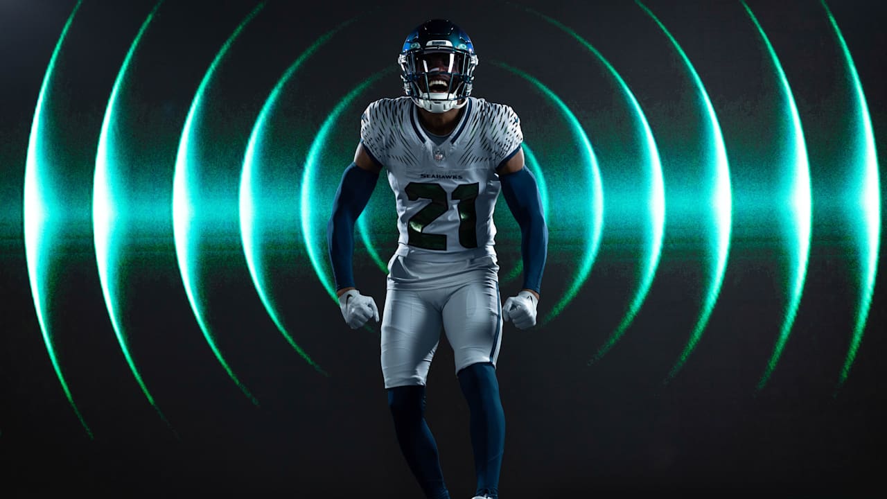
As far as I can tell the Ducks have never had a helmet that reflects different shades of blue and green, with blue socks. So unless we’re saying the Seahawks can never have a wolf grey uniform with a modern design — I think we should just let this one slide.
I do think uniforms matter in team sports. It’s your identity. You want to be able to see the uniform on TV and instantly recognise your favourite team.
I’m also a big traditionalist. I think teams should stick to age-old classics. I want the Seahawks to make the throwbacks their permanent uniforms. They look great and it’s an identity that can stand the test of time.
However, I also think the league should market these ‘special’ one-offs. It’s nice to see different ideas and modern twists for the occasional game here and there. Rather than make the throwbacks a three-game experience every season, why not use them for 12 or 13 games and then trot out something a bit different like these rivalry uniforms for the rest?
In soccer, teams change their uniforms every year and it creates a lot of income. We don’t want the NFL to go down that road, so giving teams an opportunity to produce some new merch without tampering with a classic look could be important.
I also think it’s good for fans to have new things to buy. I have a lot of typical Seahawks gear, plus other sports teams I’ve become attached to over the years. Buying merchandise is often something I’ll do when visiting a new city. Having some different looking Seahawks stuff to buy is fun — and people aren’t obliged to buy it if they don’t like the look.
In terms of the design itself I think it looks clean, interesting and different. All-white/grey uniforms can look quite boring sometimes but this isn’t. The ‘soundwaves’ on the shoulder liven things up, the number is complemented well against the ‘Seahawks’ wording which looks good centrally. Blue socks balance out the helmet and ensure the thing isn’t ‘too’ grey.
More importantly, these are way better than the ‘action green’ uniforms we’ve been forced to stare at for multiple years. I also find it off that people seemed to really like the original wolf grey uniforms but are opposed to these.
I’d like to see them build on this concept in the future, perhaps with a navy blue version to be used at home. That would be a really nice thing to do — but only after re-introducing the throwbacks as the home/road primary look.